Forum
Welcome, Guest
Please Login to access forum.
Re:Scaling Virtuemart 1.1.9 to fit width (1 viewing) 
Go to bottom
TOPIC: Re:Scaling Virtuemart 1.1.9 to fit width
#2864
Bonjour Media
Fresh Boarder
Posts: 2
User Offline
Scaling Virtuemart 1.1.9 to fit width Karma: 0  
Hi, I just installed Responsivizer on domain http://www.bonjouroutdoor.nl. I got everything looking 99% the way I wanted within 30 minutes so that is great!

I am using it as a temporary solution because I am still running J1.5/VM1.1.9 and got hit by "Mobilegeddon". The new website is not done yet (not by far). But I might very well use Responsivizer in the new version as well

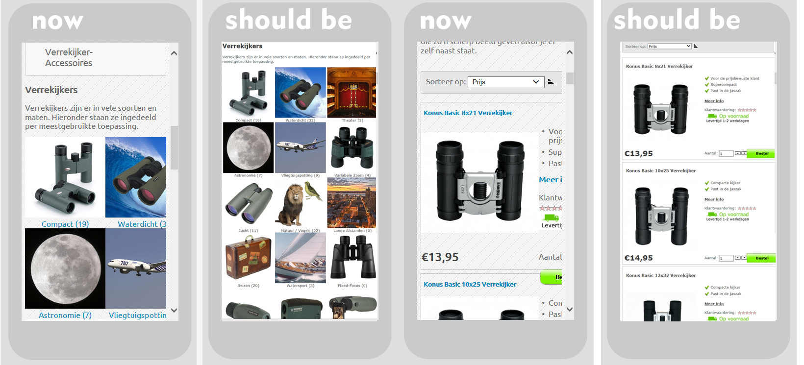
Now the problem: the Virtuemart module, normally displayed in the middle column (500px wide on desktop), is not fully displayed on mobile. How can I scale it down so that is squeezes and fits the width, like everything else does?
Is this because Virtuemart has its own theme, which cannot be overruled by Responsivizer?

Thank you very much for your time.
 
Logged Logged  
  The administrator has disabled public write access.
#2865
John Dagelmore
Admin
Posts: 3885
User Online Now
Re:Scaling Virtuemart 1.1.9 to fit width Karma: 84  
Hi,

first of all thank you and i hope that you will continue to use Responsivizer to serve an optimized mobile website even in future

About the Virtuemart problem, it could be due to a fixed width specified in the Virtuemart HTML and CSS requiring a fluid width override.
If you post here the exact page link and a screenshot i will take a look.

Greetings,
John
 
Logged Logged  
  The administrator has disabled public write access.
#2866
Bonjour Media
Fresh Boarder
Posts: 2
User Offline
Re:Scaling Virtuemart 1.1.9 to fit width Karma: 0  
Well this product-browse page: http://www.bonjouroutdoor.nl/Verrekijkers

Shows product subcategories in three columns. In mobile view, it shows the left column and about 80% of the middle icons. The right column is gone.

This a product subcategory page: http://www.bonjouroutdoor.nl/Compact
Is supposed to show the product image and price on the left and some details on the right. The details are displayed for about 20%, the rest is off-screen.


What should happen, basically, is that everything Virtuemart related should be scaled down / squeezed to fit the width of a mobile screen.
Since the Virtuemart contents ( position "user1" ) is only 500 px wide on desktop, it only has to be scaled down about 35% which would have no impact on usability.
 
Logged Logged  
  The administrator has disabled public write access.
#2867
John Dagelmore
Admin
Posts: 3885
User Online Now
Re:Scaling Virtuemart 1.1.9 to fit width Karma: 84  
Everything is related to CSS customization to override the default styles used by Virtuemart 1
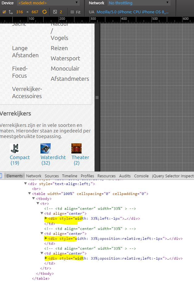
Basically everything is based on old tables and fixed widths, the 164px for each <td> element states the final width of the 3 columns images.
Overriding it with 33% fuild percentage will help.

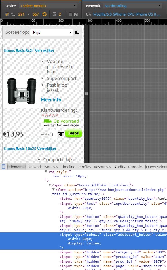
The second layout needs a more complex restyling, there is a <br> that makes the button on a new line.. also reducing the width of the quantity field will help to reduce the final width.
 
Logged Logged  
  The administrator has disabled public write access.
#2868
John Dagelmore
Admin
Posts: 3885
User Online Now
Re:Scaling Virtuemart 1.1.9 to fit width Karma: 84  
.
 
Logged Logged  
  The administrator has disabled public write access.
Go to top