Well this product-browse page:
http://www.bonjouroutdoor.nl/Verrekijkers
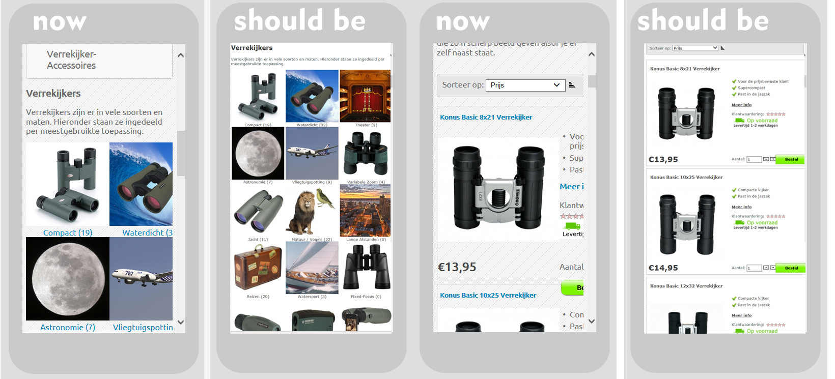
Shows product subcategories in three columns. In mobile view, it shows the left column and about 80% of the middle icons. The right column is gone.
This a product subcategory page:
http://www.bonjouroutdoor.nl/Compact
Is supposed to show the product image and price on the left and some details on the right. The details are displayed for about 20%, the rest is off-screen.
What should happen, basically, is that everything Virtuemart related should be scaled down / squeezed to fit the width of a mobile screen.
Since the Virtuemart contents ( position "user1" ) is only 500 px wide on desktop, it only has to be scaled down about 35% which would have no impact on usability.